56 lines
8 KiB
Markdown
56 lines
8 KiB
Markdown
# The Easy Intro to the APCA Contrast Method
|
||
|
||

|
||
|
||
## Metadata
|
||
- Author: [[APCA]]
|
||
- Full Title: The Easy Intro to the APCA Contrast Method
|
||
- Category: #articles
|
||
- Document Tags: [[design]] [[dev]]
|
||
- URL: https://git.apcacontrast.com/documentation/APCAeasyIntro.html
|
||
- Archive: https://web-archive.alecodes.page/bookmarks?bf=1&search=&title=The%20Easy%20Intro%20to%20the%20APCA%20Contrast%20Method
|
||
> [!tldr]
|
||
> The APCA Contrast Method is a new way to measure readability contrast, improving upon outdated WCAG 2.x guidelines. It focuses on lightness contrast, ensuring consistent visual perception across various colors and contexts. This method helps designers create more accessible web content, especially for users with different visual impairments.
|
||
|
||
## Highlights
|
||
**Visual Acuity (VA)**. VA refers to the ability to focus the eyes on a small item, to a sharp clear image. An acuity impairment limits how small an item we can focus on. An eye doctor can prescribe glasses or contacts, or perform surgery, to improve acuity. One way we can help accommodate acuity problems is to make things bigger. [View Highlight](https://read.readwise.io/read/01j80q19atq7kcj9e3xhjv3m6j))
|
||
|
||
**Contrast Sensitivity (CS)**. CS is our ability to detect edges, lines, & letters against a background. CS is separate from acuity, and we can have good acuity with poor contrast sensitivity. We can improve our contrast perception by increasing the light on the subject. On a computer screen, we can increase the difference between a darker and a lighter color. [View Highlight](https://read.readwise.io/read/01j80q35df9x2a0t34ts8r7vyj))
|
||
|
||
**Color Vision Deficiency (CVD)**. CVD is a reduced ability to distinguish different hues of color. (Sometimes called “colorblind”). Those with CVD have as good or better vision and contrast sensitivity, as standard vision. Thus, CVD does not impact readability per se. But CVD affects visual tasks such as reading a map or charts (dataviz), due to the need to discriminate colors (hue). [View Highlight](https://read.readwise.io/read/01j80q4ftg8t1nw6etbpna3xhf))
|
||
|
||
contrast between two colors is sensitive to context. This means the other items around it affects how you see it. The “spatial characteristics” of line thickness or text weight & size, govern our contrast sensitivity. [View Highlight](https://read.readwise.io/read/01j80q6p2903s73a752yvtaj83))
|
||
|
||
For readability, we need ample lightness-contrast, disregarding color as in hue. Color contrast, meaning hue/saturation, does not play a major role in readability. But ample lightness/darkness contrast enables fluent readability at best speed and comprehension. This is especially true for small body text, such as in columns or blocks. [View Highlight](https://read.readwise.io/read/01j80q83bh27pagnrreeqfeze8))
|
||
|
||
• **The contrast sensitivity threshold** **(CS)** is the point of “just noticeable differences” (JND). That is, the point between visible and invisible.
|
||
• Fluent readability refers to critical contrast. This is the smallest amount needed for best reading speed and comprehension. Peer-reviewed science tells us¹ contrast should be at least ten times the JND. The preferred contrast reserve is twenty times threshold for best fluent reading.
|
||
• Spot readability means readable without significant effort. Spot reading is the lowest readable level, where the contrast needs to be three times the JND. This low level is useful for disabled controls, copyright bugs, and other non-content. [View Highlight](https://read.readwise.io/read/01j80qcm3haxxzbq87k5070v11))
|
||
|
||
T [View Highlight](https://read.readwise.io/read/01j80qg1xsekbn8qen3c2b12ew))
|
||
|
||
he following chart demonstrates the spatial nature of human contrast sensitivity. The text samples connect the abstract science of the CS curve to practical reality.
|
||
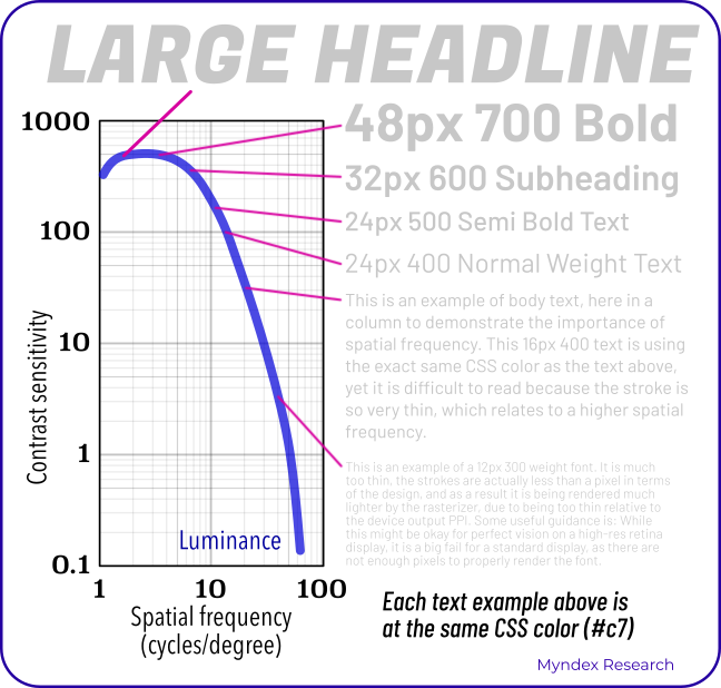 [View Highlight](https://read.readwise.io/read/01j80qftmhwxycjeeb699tq6cr))
|
||
|
||
Lightness contrast (Lc) [View Highlight](https://read.readwise.io/read/01j80qn4r2akhdg9bqz128fehm))
|
||
|
||
APCA generates a lightness contrast value for a minimum font weight, size, and color pair. This value is uniform to lightness/darkness perception. Regardless of how light or dark the two colors are, a given contrast value is visually consistent. Thus, ***Lc 60*** represents the same perceived contrast, for the range of available colors. [View Highlight](https://read.readwise.io/read/01j80qmyq1185m5xfy298yj5vt))
|
||
|
||
The APCA Readability Criteria has a basic set of levels, related to use cases. For instance, ***Lc 90*** is preferred and ***Lc 75*** is the minimum for body text. This makes it easy to use APCA, very much like WCAG guideline 1.4.3 for ease of use. [View Highlight](https://read.readwise.io/read/01j80qqdpsrb9rk2ejpzwkfy49))
|
||
|
||
The values below based on the reference font Helvetica or Arial.
|
||
• **Lc 90** - Preferred level for fluent text and columns of body text with a font no smaller than 14px/weight 400 (normal).
|
||
• **Lc 75** - The minimum level for columns of body text with a font no smaller than 18px/400. Consider Lc 75 as a minimum for text where readability is important.
|
||
• **Lc 60** - The minimum level recommended for content text that is not body, column, or block text. In other words, text you want people to read. The minimums: 24px normal weight (400) or 16px/700 (bold).
|
||
• **Lc 45** - The minimum for larger, heavier text (36px normal weight or 24px bold) such as headlines. This is also the minimum for pictograms with fine details.
|
||
• **Lc 30** - The absolute minimum for any text not listed above. This includes placeholder text and disabled element text. This is also the minimum for large/solid semantic & understandable non-text elements.
|
||
• **Lc 15** - The absolute minimum for any non-text that needs to be discernible and differentiable, and is no less than 5px in its smallest dimension. This may include disabled large buttons. Designers should treat anything below this level as invisible. Less than Lc15 will not be visible for many users. Avoid less than Lc30 for anything important for the use, understanding, or interaction of the site. [View Highlight](https://read.readwise.io/read/01j80qwns8z71advxzqxtd91x8))
|
||
|
||
The demonstrator tool provides real-time updates of minimum font size & weight vs ***Lc*** lightness-contrast. [**apcacontrast.com**](https://apcacontrast.com/) The tool has several ways to enter a color. Click on the color patches to bring up a color-picker, enter a hex value or an RGB value, or use the sliders. The text color supports alpha. A negative ***Lc*** value, such as ***Lc -60*** means the text is lighter than the background. A positive value ***Lc 60*** means the text is darker than the background (light mode). [View Highlight](https://read.readwise.io/read/01j80r1cmq4sx7cfxpy38ntfek))
|
||
|
||
• **Spatial or spatially:** relating to size, weight, or thickness.
|
||
• **Hue:** the uniqueness of a given color vs other colors, i.e. blue vs red.
|
||
• **Chroma/saturation:** the intensity or purity of a color vs no color.
|
||
• **Luminance:** a physical measure of light, disregarding hue.
|
||
• **Lightness:** the human perception of a given luminance. Also darkness and brightness. [View Highlight](https://read.readwise.io/read/01j80r1p31g0yk305pv0zjq7zz))
|
||
|